All of us here at Think! are passionate about creating custom printed items and custom designs for our clients that strengthen their brand and marketing strategies. It’s widely known that in the world of marketing, a brand and your marketing defines your organization and helps shape the experience of your customer or end user. And as industries and markets shift and grow, businesses and organizations need to adapt to change, even with their branding. That’s where we step in.
Our designers are not only great at creating logos and branding from scratch, but love the challenge of taking your existing branding collateral and creating a new a identity that matches the shifting landscape of your specific industry or organization.
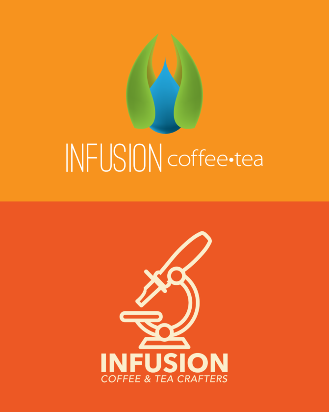
Case Study: Infusion Coffee & Tea Crafters
 Infusion Coffee and Tea is a Tempe retail coffee and tea cafe with roots in wholesale coffee and tea distribution, and coincidentally one of our oldest business neighbors. We have had a the opportunity to work with them from their initial developing stages as Espresso Italia, which specialized in distribution, to what they are now, a cafe, distribution center, and educational academy all under one roof. As you can imagine, they have a challenge of maintaining a branding balance between their international presence as a wholesale coffee and tea supplier, resource for coffee education, as well as bustling and successful local cafe.
Something that sets Infusion apart from their competition is their love for the science behind roasting. Their old logo was what you might expect from a coffee shop that values their beans, a text-based logo prioritizing a coffee bean. Worked for a while, but they’re moving on to bigger and better.
Infusion worked with our in-house designers to formulate a strategy for moving forward with a brand and marketing presence that spoke to the science and love behind the Infusion craft. A variety of new bold logos were created that incorporate a versatile stamp-style logo with a scientific microscope to call attention to their lab-like approach to quality and consistency. The top of the microscope shape is actually a tryer, which is a device used regularly to check the quality of a roast, a little nod to what’s happening behind the scenes at Infusion.
Their logo proves to be compatible with their web presence, custom garments, and even with their disposable cups and other cafe essentials. The choice to move foward with a logo that doubles as a stamp helps to reinforce their brand culture as one that roasts and packages coffee beans by hand, labels products with care but utility, and gives them that local feel that their cafe customers have grown to love. Incorporating the microscope and tryer into the logo pulls their scientific approach together to assure their coffee and tea distribution base that they are receiving a product that is meticulously crafted and considered. When visitors are at the Infusion on-site classrooms for barista workshops or public cupping events, the high visibility and cross compatability of the new Infusion logo helps brand Infusion as an authority in their industry.
Contact Think! Graphics today to find out how we can give your logo and branding a facelift and take you to the Pro status.